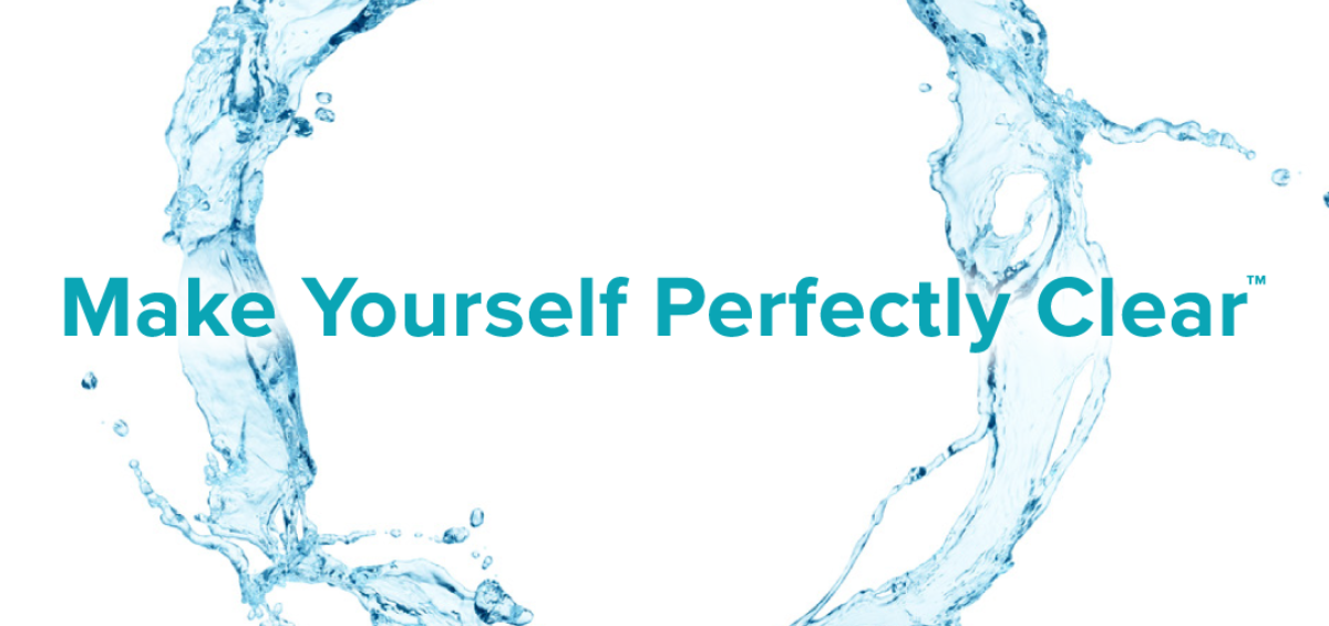
Brands are living, breathing organisms that grow and change – our own is no exception. When Stacey founded Co-Communications in 1997, she adopted the tagline “Make Yourself Perfectly Clear™” underscoring the importance of communicating with clarity and impact. Today, in a very overwhelming world of information, where the human attention is shorter than that of a goldfish, clarity has never been more critical.
During our 21 years in business, our messaging has evolved, our offerings have expanded and new opportunities have emerged. But, as the world of marketing has changed, one thing has not – just how much we love and believe in our tagline.
As we kick-off the fourth quarter, a time known for looking ahead and planning for “What’s next?”, we’re pleased to unveil our new logo and website. We remain committed to delivering big ideas, research-informed solutions and strong results – hence the dominant themes in our new website: Clearly Strategic. Clearly Creative. Clear Results.
Our newly adopted color of teal represents a feeling of calm, an oasis away from the clutter. Clear waters and clear skies remind us to look at the big picture and remain focused on finding the clarity that will allow for optimal impact. Simply put, when the path is clear, the results are clearer.
If you are considering changing marketing agencies, we encourage you to learn more about how a laser focus on clarity can help you achieve your goals and objectives. And, to those who we have worked with during this 20-plus-year journey, thank you for giving us the opportunity to deliver Clear Results.


